The Color-aid 220 Color Set is a fundamental tool revered by professionals and students across various creative disciplines. This comprehensive collection of standardized color cards provides an unparalleled resource for understanding, matching, and applying color theory in practical projects.
Quick Summary
Rating: 4.1 out of 5 stars
Price: $62.34 USD
Key Pros:
- Exceptional color accuracy and consistency across all cards.
- Comprehensive palette of 220 colors for extensive design work.
- Ideal for teaching and learning fundamental color theory principles.
Key Cons:
- Cards can be prone to wear and tear with heavy use.
- Price point may be considered high for a set of paper cards.
Table of Contents
Color-aid 220 Color Set Overview
The Color-aid 220 Color Set is an iconic and indispensable tool, particularly within art and design education. It has been a cornerstone for teaching color theory for decades, offering a tangible, consistent, and accurate representation of a broad spectrum of hues, values, and saturations.
Unlike digital color swatches that can vary greatly depending on monitor calibration and lighting conditions, Color-aid provides a physical, unchanging reference. This makes it invaluable for tasks requiring precise color communication and matching in the real world.
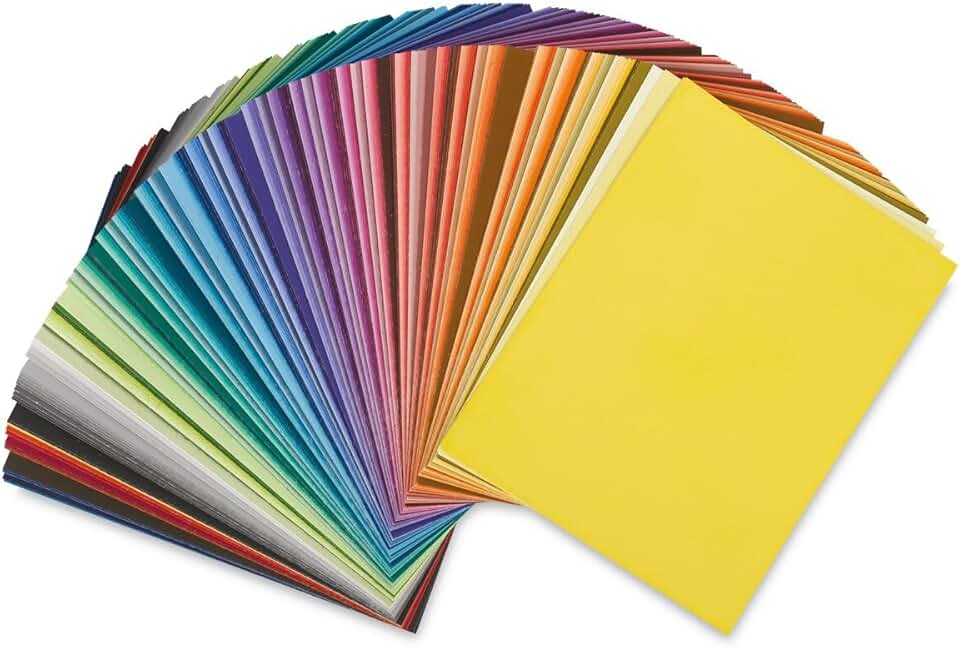
Each set comprises 220 individual cards, each measuring 4 1/2 inches by 6 inches. This generous size allows for easy handling, comparison, and arrangement, facilitating a deeper understanding of color relationships and interactions.
The cards are printed with a matte finish, which is crucial for accurate color perception. A matte surface minimizes glare and reflections, ensuring that the perceived color is as true to its pigment as possible, without interference from ambient light.
For students, the Color-aid set is often a required material in foundational design courses. It allows them to experiment with color harmonies, contrasts, and compositions without the complexities of mixing paints or relying solely on digital tools.
Professionals, from graphic designers to interior decorators, utilize Color-aid for client presentations, mood boards, and ensuring color consistency across different media. It bridges the gap between abstract color concepts and their practical application in various projects.
The standardization of the Color-aid system means that a specific color from one set should match the same color in another set. This consistency is vital for educational institutions and design studios where multiple individuals might be working with the same color palette.
Its enduring popularity is a testament to its effectiveness and reliability. In an increasingly digital world, the tactile experience of working with physical color swatches remains an essential part of the creative process for many.
This set encourages hands-on learning and practical application of complex color principles. It moves beyond theoretical discussions, allowing users to physically manipulate and evaluate color combinations in a direct and intuitive manner.
Understanding how colors interact under different lighting conditions or when placed next to other colors is a skill best honed with physical samples. The Color-aid 220 Color Set provides the perfect medium for this critical learning and professional practice.
Color-aid 220 Color Set Key Features & Specs
The features and specifications of the Color-aid 220 Color Set are specifically designed to support comprehensive color study and practical application. Each element contributes to its utility as a foundational tool in art and design.
Comprehensive 220-Color Palette
The core feature is its extensive range of 220 distinct colors. This palette is not just a random assortment but a carefully curated selection designed to represent a full spectrum of hues, along with variations in value (lightness/darkness) and saturation (intensity).
This breadth allows users to explore nuanced color relationships, create complex color schemes, and accurately match existing colors. It covers primary, secondary, and tertiary colors, as well as a wide array of tints, tones, and shades.
Having such a wide range readily available eliminates the need for guesswork or extensive color mixing, making the process of color selection and experimentation much more efficient and precise. It’s a miniature universe of color at your fingertips.
Standardized 4 1/2″ x 6″ Card Size
Each color is presented on an individual card measuring 4 1/2 inches by 6 inches. This size is deliberately chosen to be large enough for easy visual assessment and comparison, yet compact enough for practical handling and storage.
The uniform size ensures that when cards are placed side-by-side, the visual impact of the color is consistent, without distractions from varying card dimensions. This is crucial for accurate comparison and understanding of adjacency effects.
These dimensions also make the cards suitable for creating physical color studies, mood boards, or presentations. They can be easily cut, arranged, and adhered to various surfaces without being too cumbersome or too small to be effective.
Matte Finish for Accurate Perception
The matte finish on every Color-aid card is a critical specification for ensuring color accuracy. Glossy surfaces can reflect light, creating glare and altering the perceived hue, value, and saturation of a color.
By eliminating reflections, the matte finish allows users to see the true color of the pigment under various lighting conditions. This is paramount for designers who need to make critical color decisions that will translate accurately into physical products or printed materials.
This attention to detail ensures that the color you see on the card is the color you are truly working with, making it a reliable reference for professional applications where color fidelity is non-negotiable.
Consistency and Reliability
One of the most significant advantages of the Color-aid system is its commitment to consistency. The manufacturing process is designed to ensure that colors are reproduced accurately from one set to another, and across different production batches.
This standardization means that a specific Color-aid number or name will always correspond to the exact same color, regardless of when or where the set was purchased. This is a level of reliability that is difficult to achieve with custom mixed paints or uncalibrated digital displays.
For educational settings or large design teams, this consistency is invaluable, allowing for shared understanding and communication about color without ambiguity. It establishes a common language for discussing and applying color principles.
Durable Card Stock Construction
While the cards are made of paper, they are printed on a reasonably durable card stock. This construction is designed to withstand repeated handling, sorting, and comparison over time, making the set a long-lasting investment for serious users.
The thickness of the cards provides a satisfying tactile experience and prevents them from easily bending or creasing under normal use. Proper care, such as storing them flat and protected, further extends their lifespan.
This durability ensures that the set remains a reliable reference tool for many years, making it a sustainable choice for students and professionals who frequently engage with physical color samples.
Educational and Professional Versatility
The Color-aid 220 Color Set is incredibly versatile, serving both educational and professional purposes. For students, it’s a hands-on laboratory for exploring color theory principles like complementary colors, analogous schemes, and monochromatic palettes.
For professionals, it acts as a quick reference for client meetings, a tool for creating physical mock-ups, and a reliable standard for communicating color specifications with printers or manufacturers. Its portability allows it to be used in various work environments.
From graphic design and fine art to interior design, fashion, and product development, the Color-aid set provides a universal language for color. Its practical application extends to any field where visual communication and precise color matching are paramount.
Pros & Cons
Evaluating the Color-aid 220 Color Set involves looking at its strengths that make it a beloved tool, as well as considering its limitations. Understanding these aspects helps potential buyers make an informed decision.
Pros
- Exceptional Color Accuracy and Consistency: The primary advantage of Color-aid is its reliable color reproduction. Each card is meticulously printed to ensure the color is true to its specified hue, value, and saturation. This consistency is crucial for professional design work and educational demonstrations, providing an objective standard for color.
- Comprehensive Palette for Extensive Design Work: With 220 distinct colors, the set offers an incredibly broad spectrum for exploration. This allows for the creation of complex color schemes, subtle tonal variations, and precise color matching, catering to a wide array of creative needs. It eliminates the need for guesswork, providing a ready-made reference for almost any color concept.
- Ideal for Teaching and Learning Color Theory: For students and educators, Color-aid is an unparalleled hands-on learning tool. Its physical nature allows for direct manipulation and comparison of colors, making abstract color theory concepts tangible and easier to grasp. It facilitates experiments with color relationships, contrast, and harmony.
- Tactile and Intuitive Experience: In an increasingly digital world, the ability to physically hold, arrange, and compare color cards offers a unique and valuable tactile experience. This direct interaction can often lead to deeper insights and more intuitive color choices than working solely on a screen. It engages a different part of the creative brain.
- Portability and Versatility: The individual cards are easy to carry and use in various environments, from a design studio to a client meeting or an outdoor sketching session. They can be quickly pulled out for reference, allowing for on-the-spot color decisions or client approvals, enhancing workflow efficiency.
- Matte Finish Reduces Glare: The non-reflective matte surface is a significant advantage, ensuring that the true color is perceived without interference from ambient light or reflections. This is critical for making accurate color judgments, especially when comparing colors side-by-side or under different lighting conditions.
Cons
- Cards Can Be Prone to Wear and Tear: As a physical product made from card stock, the Color-aid set is susceptible to damage from heavy or careless use. Creasing, bending, smudging, or fading over time can occur, especially if not stored and handled properly. This requires users to be mindful of its care to maintain its longevity.
- Price Point May Be Considered High for Paper Cards: At first glance, the cost of the Color-aid set might seem high for what is essentially a collection of printed paper cards. However, this price reflects the precision in printing, the extensive color research, and the standardization process that ensures its accuracy and consistency, which adds significant value.
- Not Directly Integrated with Digital Workflows: While invaluable for physical color studies, the Color-aid set does not directly translate into digital color values (like Hex, RGB, or CMYK) without manual conversion or approximation. This means an extra step is required for designers who need to bridge the gap between physical and digital palettes, potentially introducing minor discrepancies.
- Limited to Visual Perception: The set relies solely on visual assessment, and does not provide tools for measuring color with scientific precision (e.g., using a spectrophotometer). While excellent for human perception, it lacks the objective data points that some industrial or highly technical applications might require for absolute color matching.
- Bulkiness for Storage: While individual cards are portable, the complete set of 220 cards, especially when kept in its original packaging or a protective case, can be somewhat bulky. This might be a consideration for users with limited desk space or those who need to transport the entire collection frequently.
Who Should Buy the Color-aid 220 Color Set?
The Color-aid 220 Color Set is a specialized tool, and while incredibly valuable, it’s not for everyone. Its primary utility lies in fields where precise color understanding, communication, and physical application are paramount.
Here’s a breakdown of who would benefit most from investing in this amazing set:
Art and Design Students
This is arguably the largest demographic for Color-aid. Many foundational art and design programs, especially those focusing on graphic design, fine art, and interior design, often list the Color-aid set as a required material. It’s an indispensable learning tool for understanding color theory fundamentals.
Students use it to grasp concepts like hue, value, saturation, color harmony, and contrast in a hands-on manner. It allows them to physically experiment with color relationships, create mood boards, and develop their color sensibilities without the complexities of digital tools or mixing paints.
Art and Design Educators
Professors and instructors rely on Color-aid as a consistent and effective teaching aid. Its standardized colors provide a common reference point for discussions and assignments, ensuring that all students are working with the same visual information.
It simplifies the demonstration of complex color interactions and allows for clear, unambiguous communication about color principles in the classroom. The physical cards are excellent for group exercises and critiques.
Graphic Designers and Illustrators
Even in a predominantly digital field, graphic designers find Color-aid useful for bridging the gap between screen and print. While digital color values are essential, a physical reference helps in selecting colors that will look consistent across various printed materials.
It’s excellent for client meetings to discuss color palettes, create physical mock-ups, or ensure brand color consistency. Illustrators can use it for planning color schemes before committing to digital painting or traditional media.
Interior Designers and Decorators
For those working with physical spaces, Color-aid is invaluable. Interior designers use it to select paint colors, fabrics, and finishes, ensuring that the chosen palette harmonizes within a room. It helps in communicating color choices to clients, who often prefer to see physical swatches rather than relying solely on digital renderings.
It’s particularly useful for creating color schemes that account for natural and artificial lighting conditions, as physical cards react more realistically than screen representations. This helps in avoiding costly mistakes in material selection.
Fashion Designers and Textile Artists
Color is paramount in fashion. Designers can use Color-aid to develop seasonal color palettes, match fabrics, and coordinate accessories. The physical cards help in visualizing how different colors will interact when translated into garments and textile patterns.
It’s a practical tool for creating mood boards and communicating precise color specifications to manufacturers, ensuring that the final product aligns with the design vision. This reduces discrepancies between design and production.
Fine Artists (Painters, Sculptors)
While painters often mix their own colors, Color-aid can serve as an excellent reference for color studies, understanding pigment properties, and planning complex palettes. It helps in training the eye to discern subtle differences in hue, value, and saturation.
Sculptors or mixed-media artists who incorporate color into their work can use it for material selection or surface treatment planning, ensuring a cohesive aesthetic across different components of their artwork.
Anyone Needing Consistent Physical Color Reference
Beyond specific professions, anyone who frequently needs to compare, match, or communicate colors in a physical medium will find the Color-aid 220 Color Set invaluable. This includes hobbyists, crafters, or even homeowners planning renovation projects.
It provides a reliable benchmark that digital screens cannot always replicate consistently. For tasks where color fidelity is important and a physical sample is preferred, Color-aid offers an affordable and effective solution compared to more expensive color management systems.
Ultimately, if your work or studies involve deep engagement with color theory, require consistent color communication, or benefit from a tactile approach to color selection, the Color-aid 220 Color Set is a highly recommended investment. It empowers users with a foundational understanding and practical toolset for mastering color.
FAQ about Color-aid 220 Color Set
Here are some frequently asked questions about the Color-aid 220 Color Set, providing further insights into its use, care, and value.
Q: What is the primary purpose of the Color-aid 220 Color Set?
A: The primary purpose of the Color-aid 220 Color Set is to serve as a comprehensive, standardized, and physical reference for color. It’s used for teaching and learning color theory, creating color palettes, matching colors, and communicating precise color information in art, design, and other creative fields.
It provides a consistent visual aid for understanding how colors interact and for making informed color decisions for various projects, both academic and professional.
Q: How does Color-aid compare to other color systems like Pantone?
A: Both Color-aid and Pantone are standardized color systems, but they serve slightly different niches. Color-aid is primarily an educational tool for understanding color theory and relationships, offering a broad spectrum of hues, values, and saturations on matte paper.
Pantone is more focused on industrial standardization and exact color matching for printing, manufacturing, and brand identity, often with specific ink formulations and a wider range of specialty colors. While Color-aid helps you understand *how* colors work, Pantone helps you specify an *exact* color for production. Some designers use both, with Color-aid for ideation and Pantone for final production specifications.
Q: Are the colors fade-resistant?
A: While Color-aid cards are produced with high-quality pigments, like most printed materials, they are not entirely immune to fading, especially with prolonged exposure to direct sunlight or harsh UV light. Over time, colors may subtly shift or diminish in intensity.
To preserve the accuracy and longevity of your Color-aid set, it is highly recommended to store the cards in a cool, dry place away from direct sunlight, perhaps in their original box or a protective portfolio. Proper storage will significantly extend their useful life as accurate color references.
Q: Can I replace individual cards if they get damaged or lost?
A: Typically, Color-aid sets are sold as complete units, and individual replacement cards are not readily available from the manufacturer or standard retailers. This means if a card is damaged or lost, you might need to purchase an entirely new set or learn to work around the missing color.
This reinforces the importance of careful handling and storage of your set to prevent damage. Treating your Color-aid cards as valuable tools will ensure they remain intact and usable for a long time.
Q: Is the Color-aid set suitable for digital artists?
A: Yes, the Color-aid set can be very beneficial for digital artists, although its direct application differs. While it doesn’t directly provide RGB or Hex codes, it helps digital artists develop a strong foundation in color theory and an intuitive understanding of color relationships.
It allows for physical experimentation with color palettes that can then be translated into digital art. Many digital artists use Color-aid to plan their color schemes offline, before inputting approximated values into their software. It enhances their color perception skills, which are crucial for effective digital work.
Q: How do I care for my Color-aid 220 Color Set to ensure its longevity?
A: Proper care is essential for maintaining the accuracy and condition of your Color-aid set. Always handle the cards with clean hands to avoid transferring oils or dirt, which can smudge or discolor the matte surface. Store the cards flat in their original box or a dedicated portfolio to prevent bending, creasing, or warping.
Keep the set away from direct sunlight, extreme temperatures, and high humidity to prevent fading and material degradation. Avoid exposing them to liquids or chemicals. By following these simple guidelines, your Color-aid set will remain a reliable tool for many years.
Q: What are the exact dimensions of each Color-aid card?
A: Each individual card in the Color-aid 220 Color Set measures precisely 4 1/2 inches by 6 inches (approximately 11.4 cm by 15.2 cm). This uniform size is intentionally chosen to provide an optimal viewing area for color assessment without being too bulky for handling or too small to make clear distinctions.
The consistent dimensions allow for easy arrangement and comparison of multiple colors simultaneously, which is fundamental for effective color study and palette development. This standardization contributes significantly to the set’s utility as a professional and educational resource.
Q: Why is a physical color set still relevant in a digital age?
A: Despite advancements in digital color management, physical color sets like Color-aid remain highly relevant for several reasons. Digital screens emit light, and their color representation varies based on calibration, display technology, and ambient lighting, making consistent color judgment difficult.
Physical cards, being reflective, show color as it appears in the real world under natural or artificial light, offering a more accurate perception for print, product design, and environmental applications. They provide a tactile experience crucial for learning and intuitive decision-making, and offer a universal, unchanging reference point that transcends digital variations. For more information on color theory, consult resources like Wikipedia’s Color Theory page.
Final Verdict
The Color-aid 220 Color Set stands as an enduring testament to the importance of physical color references in the world of art and design. Its comprehensive palette, meticulous accuracy, and consistent matte finish make it an indispensable tool for anyone serious about understanding and applying color theory.
While its price point might give some pause, and the cards require careful handling, these minor considerations are far outweighed by the immense educational and professional value it provides. It offers a tangible, reliable, and hands-on approach to color that digital tools simply cannot fully replicate.
For art and design students, educators, graphic designers, interior decorators, and anyone seeking a foundational and practical understanding of color, the Color-aid 220 Color Set is an amazing and essential investment. It elevates your ability to perceive, communicate, and create with color, making it a truly worthwhile addition to any creative toolkit.